The Ultimate Guide to Custom QR Codes: Design, Print, and Drive More Scans
Custom QR codes have evolved from simple black-and-white squares into powerful, branded gateways that connect offline moments to digital experiences. With a custom QR code generator, you can design a QR code with your brand colors, add your logo, choose a dot style (square, rounded, dotted), and export a high-resolution file ready for web or print. This guide shows you exactly how to create a custom QR code that looks premium, scans instantly, and actually drives results—whether you’re promoting a restaurant menu, an event RSVP, a product video, or a limited-time offer.
Below, you’ll learn how to design a custom QR code with logo, follow best practices for scannability, pick the right sizes for different placements, use UTM tags to track scans, avoid common mistakes, and roll out a campaign that earns real engagement. Bookmark this as your go-to playbook for custom QR codes.
What is a custom QR code—and why it matters
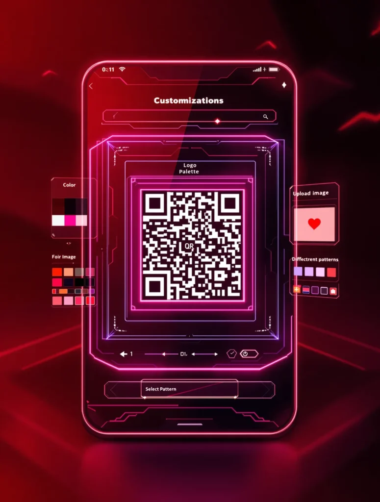
A custom QR code is a scannable barcode that’s styled to match your brand. Instead of a generic black-and-white square, you can:
- Apply brand colors (dark foreground on a light background).
- Add your logo within the code area (without breaking scannability).
- Choose a dot pattern (square, rounded, dotted) for a distinctive look.
- Export a crisp PNG for digital use or SVG for print at any size.
Why this matters: branded QR codes increase trust, catch attention, and boost scan-through rates. When you combine good design with a clear call to action—“Scan for 20% off,” “Scan to view menu,” “Scan to RSVP”—you make it obvious what users get when they scan. That clarity is a conversion booster.
Core Design Principles for Scannability and Style
Great design is more than looks; it’s also about reliability. Follow these fundamentals to keep your custom QR code scannable everywhere.
1) Maximize contrast
- Use a dark, saturated foreground (e.g., black, navy, deep green).
- Keep the background light (white or off-white). Avoid low-contrast combos, thin gradients, or busy backdrops.
- If you overlay on images, place the code inside a solid white container to preserve contrast.
2) Respect the quiet zone
- The quiet zone is the margin around the QR code. It must remain empty.
- Keep at least four “modules” (the tiny squares) of space around the code.
- Never crop the code or butt it against other elements.
3) Choose a reliable dot style
- Square: maximum clarity and edge definition; most robust for scanning.
- Rounded/Dots: friendlier look, on-brand for modern designs; still reliable if contrast is high.
- Avoid ultra-thin strokes or excessive visual noise.
4) Be smart with logos
- Keep the logo within 20–30% of the code area.
- Prefer simple, high-contrast logo marks without tiny details.
- After adding a logo, test scanning on multiple devices and distances.
5) Size it for the real world
- Business cards: 2–2.5 cm (0.8–1.0 in) square.
- Flyers/posters: 3–5 cm (1.2–2.0 in) minimum.
- Outdoor signage: follow the “10x rule”—maximum scan distance ≈ 10× the code width.
- If in doubt, go bigger. Size and contrast beat intricate styling.
6) Pick the right file format
- PNG: perfect for websites, emails, presentations, social posts.
- SVG: vector-based and print-perfect—razor sharp at any size.
- For print, avoid JPG (compression artifacts can impact scanning). Convert to CMYK at the print stage if needed.
7) Keep data density reasonable
- Long URLs make the code denser and harder to scan.
- Use a short link (ideally a branded short domain).
- Add UTM parameters to track source, medium, and campaign.
Step-by-Step: Make a Custom QR Code That Performs
- Define the destination
- Choose a clear, mobile-friendly landing page (HTTPS).
- Use a branded short link and add UTM tags (e.g., utm_source=qr&utm_medium=print&utm_campaign=menu_q2).
- Enter your content
- Paste the URL or text you want your code to resolve to.
- For contact sharing, consider a vCard. For Wi‑Fi, use a Wi‑Fi QR.
- Customize design
- Foreground: dark brand color. Background: white/off-white.
- Dot style: square for maximum reliability; rounded/dots for a softer, on-brand look.
- Add logo within 20–30% of code area. Keep it simple and test.
- Add a clear CTA
- Place copy near the code: “Scan to order,” “Scan for menu,” “Scan to claim offer.”
- Add a short fallback URL under the code for accessibility.
- Export in the right format
- PNG for digital. SVG for print and signage.
- For print: test a sample, check glare, and validate scans in real lighting.
- Test thoroughly
- iOS and Android default cameras + popular QR apps.
- Different distances, angles, and lighting conditions.
Style Choices That Strengthen Your Brand
Color strategy
- Primary brand color for dots; neutral light background for contrast.
- If your brand palette is light, consider a darker, brand-adjacent variant specifically for QR foregrounds.
- Avoid inverse designs (light dots on dark backgrounds). They can scan, but reliability drops.
Dot style and visual personality
- Square: professional, technical, and highly legible.
- Rounded: friendly and modern; pairs well with lifestyle brands.
- Dotted: playful and eye-catching; ensure dots are substantial enough for scanners.
CTA copy that converts
- Be direct and benefit-driven:
- “Scan to save 20% today”
- “Scan to reserve your seat”
- “Scan to watch the demo”
- “Scan to get directions”
- “Scan to track your order”
- Consider urgency or exclusivity when appropriate:
- “Scan before midnight for early access”
- “Scan for VIP pricing”
Placement, Printing, and Production Tips
- Place at eye level on posters; top third on flyers; flat, uncluttered area on packaging.
- Avoid glossy hotspots and curved surfaces that distort the pattern.
- Use matte finishes or soft-touch laminates to reduce glare.
- For apparel or textiles, use high-contrast patches and test on the final fabric.
- Always proof a small run first, scan-test, then scale up.
Static vs. Dynamic QR Codes (and How to Track Scans)
- Static custom QR code: hard-codes the destination. Simple, permanent, great for stable URLs (menus, contact, evergreen pages).
- Dynamic flow: lets you change destinations later and often adds built-in analytics. If you don’t use a dynamic system, you can still track performance with UTM tags.
UTM tagging essentials
- utm_source: where the code appears (poster, flyer, packaging, businesscard).
- utm_medium: always “qr” for clarity (qr).
- utm_campaign: the campaign or period (spring_sale, event2025, menu_q3).
Example:
https://yourbrand.com/menu?utm_source=table_tent&utm_medium=qr&utm_campaign=menu_q3
Analyze traffic in your analytics tool to see scans by placement and campaign.
Accessibility and Inclusivity
- Add helper text beneath the code: “Scan with your phone’s camera.”
- Include a short, human-readable fallback URL.
- Ensure adequate size and contrast for low-vision users.
- Mind reachability: place within comfortable scanning distance for wheelchair users at public installations.
Security and Trust
- Always point to HTTPS pages.
- Prefer recognizable, branded domains (trust signal).
- Use transparent CTAs (“Scan to verify authenticity,” “Scan to pay securely”).
- Retire or redirect outdated codes to prevent confusion.
- For payments or sensitive flows, don’t request unnecessary permissions post-scan.
Troubleshooting: Why Won’t My QR Code Scan?
- Low contrast or busy background: Use a solid light background and dark dots.
- Too small: Increase size; remember the 10x rule for distance.
- Cropped quiet zone: Add margin; don’t place graphic elements too close.
- Glare or curvature: Move to a matte surface and flatter area.
- Dense pattern from long URL: Use a short, branded link.
- Logo too big: Reduce to 20–30% of code area and retest.
Create a test matrix:
- Devices: iPhone and Android (multiple models).
- Apps: native camera + popular QR apps.
- Conditions: bright light, indoor light, low light, angled scans, distance tests.
Industry Playbooks: Custom QR Codes That Drive Results
Restaurants and Cafés
- Use cases: menus, ordering, table-side payment, loyalty sign-ups, reviews.
- CTA examples: “Scan for menu,” “Scan to order & pay,” “Scan to review us—get a free dessert.”
- Pro tip: Add UTM tags per table (table01, table02) to see which sections get the most scans and optimize placement.
Retail and E‑commerce
- Use cases: product details, how-to videos, coupons, returns portal, back-in-stock alerts.
- CTA examples: “Scan to watch setup video,” “Scan for 10% off,” “Scan to start a return.”
- Pro tip: Put codes at shelf-level eye height with matte labels; use SVG for clean small-format printing.
Events and Conferences
- Use cases: RSVP, agenda, speaker bios, venue maps, lead capture, feedback surveys.
- CTA examples: “Scan to RSVP,” “Scan for today’s agenda,” “Scan to connect with speakers.”
- Pro tip: Color-code each day’s schedule QR for quick recognition; track scans by entrance location.
Real Estate
- Use cases: property listings, 3D tours, disclosures, open house sign-ins, appointment booking.
- CTA examples: “Scan for 3D tour,” “Scan to book a viewing,” “Scan for disclosures.”
- Pro tip: Outdoor signs need larger codes; follow the 10x rule and use weatherproof, low-glare materials.
Healthcare and Clinics
- Use cases: appointment scheduling, forms, prep instructions, billing portal, patient education.
- CTA examples: “Scan to schedule,” “Scan for pre-visit checklist,” “Scan to pay bill.”
- Pro tip: Place codes in waiting rooms and at check-in; ensure secure, HIPAA-conscious destinations.
Education and Training
- Use cases: course materials, attendance, lab safety guides, feedback forms, career services.
- CTA examples: “Scan for lecture slides,” “Scan to check in,” “Scan for internship resources.”
- Pro tip: Use short fallback URLs prominently for students without working cameras.
Nonprofits and Community Organizations
- Use cases: donations, volunteer sign-ups, impact reports, event details, petitions.
- CTA examples: “Scan to donate,” “Scan to volunteer,” “Scan for impact report.”
- Pro tip: Show the outcome: “Scan to plant a tree today” boosts motivation.
SaaS and Startups
- Use cases: demos, case studies, gated trials, conference booth lead capture, product updates.
- CTA examples: “Scan to watch the demo,” “Scan for case studies,” “Scan to start free trial.”
- Pro tip: Use UTM tags per conference, per booth panel, and per collateral type to measure ROI.
Personal Branding and Portfolios
- Use cases: vCard, portfolio, LinkedIn, booking, link-in-bio hubs.
- CTA examples: “Scan to save my contact,” “Scan to view portfolio,” “Scan to book a call.”
- Pro tip: On business cards, keep 2–2.5 cm minimum and a clean white background area.
Campaign Ideas and Growth Loops
- Offer unlock: “Scan to reveal coupon,” “Scan for backstage pass,” “Scan for early-bird tickets.”
- Geo-targeted experiences: Use different destinations per location; tag UTMs accordingly.
- Post-purchase onboarding: QR on packaging to drive tutorials, warranty registration, and reviews.
- Loyalty loops: QR on receipts or table tents leading to points accrual or surprise rewards.
- Community engagement: QR scavenger hunts, map overlays, “vote with a scan” installations.
Common Mistakes to Avoid
- Using light dots on a dark background (low reliability).
- Placing the code on glossy, reflective surfaces without testing.
- Cropping or visually “framing” the code too tightly—quiet zone is sacred.
- Overloading the code with too-long URLs (densifies the pattern).
- Shrinking the code to fit the layout instead of designing around it.
- Forgetting a CTA—people scan when you tell them why to scan.
Advanced Tips for Power Users
- A/B test CTAs: “Scan to save” vs. “Scan for 20% off.” Track which earns more scans and conversions.
- Segment by placement: Use unique UTM sources for poster, bag insert, receipt, product tag.
- Deep linking: If you have an app, use universal/app links to open directly in-app.
- Fallback logic: If users lack internet at the moment of scan, print a short URL as backup or point to a locally accessible vCard or offline PDF where relevant.
- Seasonal variants: Refresh colorways or CTAs per campaign while keeping core brand consistency.
- Retargeting: Link to pages with pixels installed so your QR traffic powers future ad audiences.
Measurement: Metrics That Matter
- Scan volume by placement: Which channels deliver the most scans?
- Scan-through rate (STR): scans divided by impressions (estimated foot traffic or distribution count).
- Click-to-conversion rate: sign-ups, orders, RSVPs—whatever your goal is.
- Time to scan: measure how quickly scans ramp after distribution to optimize launch timing.
- Cohort performance: compare QR campaigns by season, location, or creative variant.
Simple formula ideas:
- STR ≈ scans / estimated viewers.
- Poster ROI: (revenue attributed to QR traffic − printing cost − placement cost) / total cost.
Use consistent UTM naming conventions and keep a log of each campaign’s assets and settings for clean analysis later.
FAQ: Custom QR Code Essentials
Q: What’s the best size for a business card QR code?
A: 2–2.5 cm (0.8–1.0 in) with a solid light background and high contrast. Always test prints before bulk ordering.
Q: Should I use PNG or SVG?
A: PNG for digital. SVG for print and large formats. SVG scales infinitely and stays razor-sharp.
Q: Will adding my logo reduce scans?
A: It can if the logo is too large or detailed. Keep it within 20–30% of the code area and ensure high contrast. Test across devices.
Q: Can I track scans without a dynamic code system?
A: Yes. Use short links with UTM parameters to attribute traffic in your analytics.
Q: Do custom colors still scan?
A: Absolutely—if contrast is strong (dark dots on a light background). Avoid pale tones and busy gradients.
Q: What’s the quiet zone and why is it important?
A: The empty margin around the code. Scanners rely on it to detect boundaries. Don’t crop it or place design elements too close.
Glossary (Quick Reference)
- Quiet zone: The required empty margin around a QR code.
- Modules: The tiny squares that make up the code.
- Error correction: Built-in redundancy that helps codes scan even if partially obscured.
- UTM parameters: URL tags (source, medium, campaign) used to track traffic.
- Static QR: Destination is fixed at creation.
- Dynamic flow: Destination can be changed later (and usually adds analytics).
Your Action Plan: Launch a Scan-Worthy Custom QR Code Today
- Choose a clear, mobile-optimized destination with HTTPS.
- Build a short, branded URL and append UTM parameters.
- Use your custom QR code generator to add brand colors, a tasteful logo, and a readable dot style.
- Write a strong CTA near the code, plus a short fallback URL for accessibility.
- Export PNG for digital, SVG for print.
- Test on multiple devices, in real lighting, at realistic distances.
- Print on matte or low-glare materials and respect the quiet zone.
- Measure scans and conversions, then iterate with A/B-tested CTAs and placements.
Done right, a custom QR code is more than a scannable square—it’s a branded, trackable bridge between your physical presence and your digital experience. Design with contrast, print with care, write CTAs that promise value, and measure everything. That’s how you turn “just a QR code” into a growth channel.